Jan 30th 2014, 12:00, by Josh Constine
![1_NewsFeed[7]](http://tctechcrunch2011.files.wordpress.com/2014/01/1_newsfeed7.jpg?w=1024)
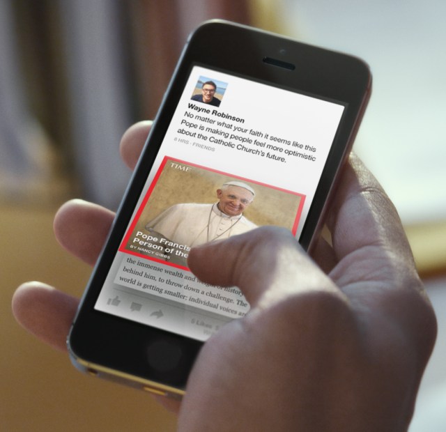
You miss great content because you aren’t subscribed to the right sources. So Facebook wants to bring you content serendipity with Paper, a standalone iOS news reader app it revealed today that delivers human and algorithm-curated full-screen articles and photos in categories you select like Tech, LOL, and Pop Culture. Paper launches to everyone in the US on February 3rd, the day before Facebook’s 10th birthday.
Paper is the first app out ofFacebook Creative Labs, an initiative to let small teams within Facebook build standalone mobile experiences as if they were nimble startups. Facebook Creative Labs will carry out the strategy Mark Zuckerberg discussed on yesterday’s earnings call ofconquering mobile with an array of single-purpose experiences rather than cramming more functionality into Facebook’s core app.

I was the first to catch a glimpse of the radically visual News Feed redesign that would become Paper a year ago. TechCrunch writer Ingrid Lunden discovered more about on the project in June, andRe/code’s Mike Isaac revealed details on the news reader earlier this month. But now Facebook has officially outed Paper with a blog post, feature tour, and the vision video embedded below.
Paper fulfills Zuckerberg’s desire for Facebook to become the modern age’s newspaper.
![2_Sections[7]](http://tctechcrunch2011.files.wordpress.com/2014/01/2_sections7.jpg?w=640&h=529) When you download Paper, you’re greeted with a reimagined interface for the News Feed. The top half of the screen shows big photos and videos, while the bottom half shows status updates and link stories. You can swipe from right to left to browse through the stories. If you tap one, it unfolds with a delightful animation to take up the full screen where videos auto-play. Pinch a story and it folds back up returning you to the Paper feed.
When you download Paper, you’re greeted with a reimagined interface for the News Feed. The top half of the screen shows big photos and videos, while the bottom half shows status updates and link stories. You can swipe from right to left to browse through the stories. If you tap one, it unfolds with a delightful animation to take up the full screen where videos auto-play. Pinch a story and it folds back up returning you to the Paper feed.The content gets really interesting, though, when you start adding “sections” to your own Paper.
You can add sections including “Score” (sports), “Headlines” (world news), “Cute” (BuzzFeed-style adorable animals), “Planet” (sustainability and earth porn), “Enterprise” (business), “Exposure” (photography), “Flavor” (food), and “Ideas” (a different intellectual theme each day).
![3_HiResPhotos[7]](http://tctechcrunch2011.files.wordpress.com/2014/01/3_hiresphotos7.jpg?w=640&h=604) Each Section combines stories chosen by Facebook’s human editors and surfaced by the Paper algorithm that have been posted publicly to Facebook by a publication, blogger, public figure, or average joe. The goal isn’t to just pump articles by The New York Times, but also posts by expert yet undiscovered bloggers, commentary by industry pundits, and opinions from laymen. For now, everyone who adds a Section to their Paper will see the same story in it, but Facebook says its considering personalizing the sections so you might see more about your favorite teams and sports in the Score Section over time.
Each Section combines stories chosen by Facebook’s human editors and surfaced by the Paper algorithm that have been posted publicly to Facebook by a publication, blogger, public figure, or average joe. The goal isn’t to just pump articles by The New York Times, but also posts by expert yet undiscovered bloggers, commentary by industry pundits, and opinions from laymen. For now, everyone who adds a Section to their Paper will see the same story in it, but Facebook says its considering personalizing the sections so you might see more about your favorite teams and sports in the Score Section over time.Paper also lets you share your own stories. The visually-focused composer gives you an accurate preview of how your story will appear to other users, so there’s no wondering what photo will be featured or if an article’s blurb will be cut off like when you share using Facebook on the web or mobile.

Content Serendipity
Paper’s human plus machine curation creates what I call “content serendipity”. Normally on Facebook, you only see posts from friends and Pages you’ve subscribed to. But with a traditional newspaper, there are articles the editors think are great and you might enjoy, but that you wouldn’t have thought to seek out. You trust the editors’ taste, and give articles a chance even if they don’t strike you at first glance.Paper creates this opportunity for Facebook to surprise like a newspaper, but on mobile. It can show content you might have missed by bubbling up public content with lots of Likes or that a Paper editor thinks is brilliant. Sure, friends act as curators of the web at large, but not everyone’s friends share content in the areas they’re interested. I might be the only one of my friends that digs business news or foodie stuff, and Paper could deliver it to me without me having to track down specific Pages to Like.

Facebook says it won’t be heavily promoting Paper within its standard app, but it still poses a big threat to other news reader apps like Flipboard, Prismatic, Circa, and Pulse. Each has its strengths. Flipboard has magazines curated by other users, while Prismatic relies on artificial intelligence to provide the most relevant articles. Facebook’s massive treasure chest of data on what people share could be its not-so-secret weapon. Then again, some of Facebook’s standalone apps like Camera and Poke have failed miserably despite their advantages so we’ll have to wait to see how things shake out.
The 15-person Paper team spent well over a year building the app. It was spearheaded by Facebook’s VP of Chris Cox and endorsed by Zuck but product managed by Michael Reckhow, and designed by Mike Matas. Rather than be bogged down by the company’s bureaucracy, the team hacked at Paper like Facebook did back in its more “move fast and break things” days.
If Paper succeeds, it could get more people sharing publicly, and make us even more addicted to and delighted by Facebook’s content stream. The web’s a big place, but Paper could use big data and big brains to make it feel small enough to comprehend, just a like a newspaper.
For more on Facebook’s big new standalone app strategy, check out my feature piece: “Facebook’s Plot To Conquer Mobile: Shatter Itself Into Pieces“


No comments:
Post a Comment