Dec 23rd 2013, 16:15, by Ryan Lawler

There are few things in life that are more boring than pay day. Every couple of weeks, working stiffs get an envelope with a jumble of numbers on a plain white background that is meant to show them how much they’ve made over the course of the last pay period.
But it doesn’t have to be that way. Which is why a few months ago, payroll startup ZenPayroll spent a week redesigning the way it communicated with its users on pay day.
ZenPayroll is a two-year old company that wants to change the way that people get paid, simple as that. It does that on both sides of the equation, first by making it ultra-easy for employers to do payroll, and secondly by improving the actual experience of getting paid for employees.
Most small- and medium-sized businesses today don’t have a good system in place for doing payroll. Indeed, according to ZenPayroll CEO Joshua Reeves, the vast majority do it manually, which ends up leading to mistakes and fines levied against them for accounting disparities. ZenPayroll has built a system where they only need to put in employee information once and then the platform takes care of all recurring payments, while making one-time bonuses or hourly wages also easy to enter.
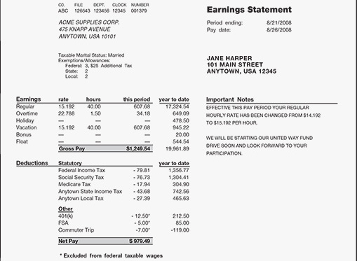
But the company saw an opportunity to also improve the experience for employees. After all, pay day hasn’t fundamentally changed in a long time. A lot of people today get their pay direct deposited into an account and never even look at their pay stub. And if they do, they’re greeted with something that looks like this:

Boring, right?
“Today, payday is an impersonal, transactional event,” Reeves told me. So the company set out to change that, and to make the notification that an employee receives about their pay an actual enjoyable experience.
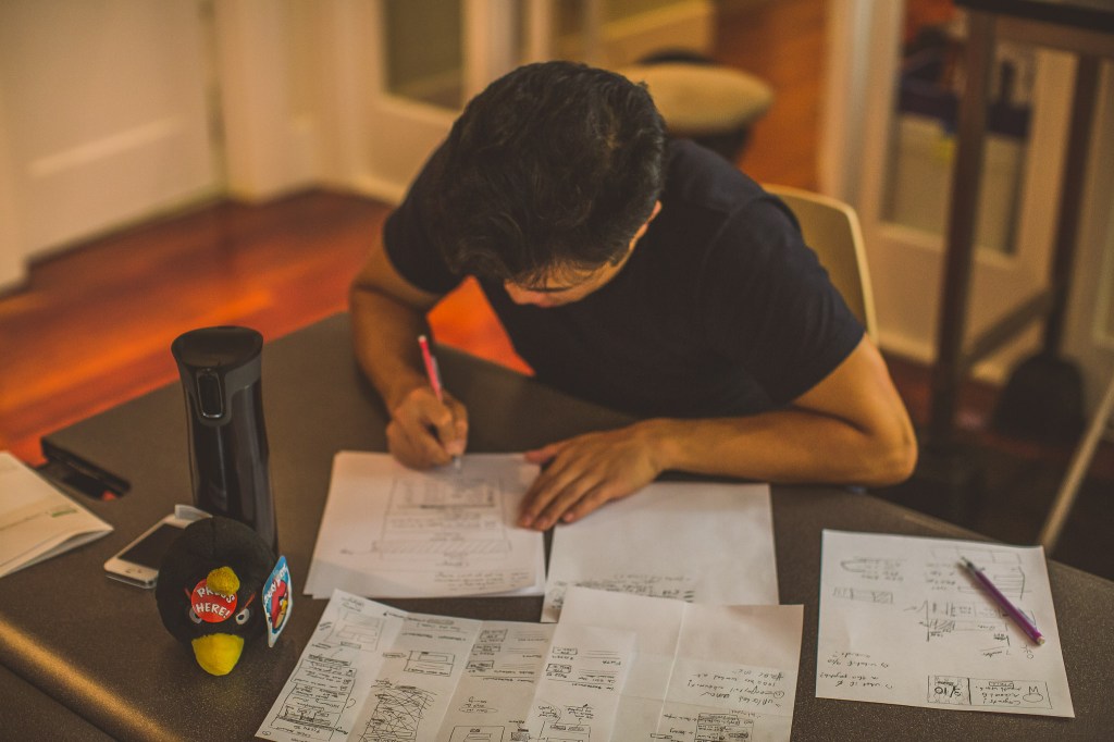
To do that, ZenPayroll borrowed the idea of running a “design sprint” from Google Ventures. Over the years, the investor’s design team has worked to perfect the art of the design sprint process, in which startups are asked to quickly re-examine and re-build their products over the course of just five days.
Google Ventures runs a bunch of design sprints with its portfolio companies, providing a structure for them to participate in ultra-fast iteration. The process was born out of Google’s own internal efforts to quickly redesign various products over time, and the venture arm now does about 30 sprints with startups it’s invested in per year.
The typical design sprint takes place over five days, during which the teams go through five distinct steps to development. Day 1 is all about understanding the problem, Day 2 is about coming up with as many possible ways of attacking it as possible, Day 3 is about choosing the best ideas to go forward with, Day 4 is about prototyping the new product or design, and Day 5 is for validating what the teams have come up with by showing the prototype to others.
For some startups, Google Ventures takes a more hands-on approach to design sprints. Since ZenPayroll has its own design team, and the GV folks mostly lent a helping hand in structuring the process. For ZenPayroll the big goal was in changing the relationship that employees had with the boring pay stubs that they get every week.
“With this project we knew we wanted to empower the employee, and to make their pay day something that’s unique to ZenPayroll,” Reeves said. That meant making it something employees could actually celebrate, instead of just filing away with other boring paperwork, never to be seen again.
In a strange sort of way, it’s the constraints of the design sprint that enable more creativity, Reeves told me. “When you have fixed time periods… that lets you move forward without getting caught up in individual details,” he said.

In the case of ZenPayroll, the constraints meant both and making quick decisions about what to include and what not to.
In the first step, spent an entire day — one-fifth of its allotted time — just doing as much research as possible to find out what’s wrong with current pay stubs. That might seem like a lot, considering how little time the team had, but it helped to inform the next part put of the process, which was to set down as many ideas as possible for how they could fundamentally change what pay day looked like.
For PR Lead Steffi Wu, who was part of the design sprint team, the diverge phase of Day 2 — in which the team puts down as many ideas as possible on Post-Its — was the most important part of the process. Or at least the most fun.
“We thought about ‘What are the possibilities of pay day?’” she said. “Now it’s horrible and banal, but what are ways that we can make it happy and rewarding?” To change that, the team set about trying to make getting paid a ritual that actually makes people happy.
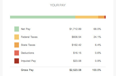
Part of that ritual and delight was simply providing a more visual, more beautiful way to show the breakdown of an employee’s salary and where all of a person’s money went as part of its email notifications. A number of people don’t even bother looking at their pay stubs, but ZenPayroll hoped that by making them easier to understand, it would increase the likelihood that they’d open their pay day notifications.

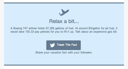
Another way that the company tried to delight users is by providing them with fun facts about the amount of money they made. Like this one:

All in all, ZenPayroll hopes to continue iterating on the way that it communicates with users. After all, as Reeves told me, being a software-based company means always seeking to make your product better. “When we think about the idea of how you build software — you’re never done with that process,” he said. “There are always ways to get better, and there are always way to improve the product.”
And now that it’s been through the design sprint process once, ZenPayroll is a lot more likely to use it the next time the company is ready to reimagine one of its products.

No comments:
Post a Comment