Google
is testing a simple, visual interface to replace its text-based black
navigation strip, and you can try it out right now with a small tweak to your browser.
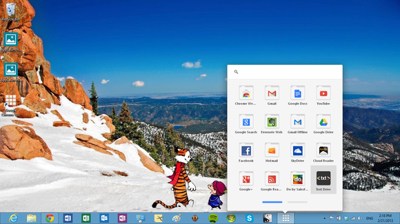
The experimental design replaces Google's ubiquitous black bar with the Chrome OS app lancher, which
drops down into a grid of icons for sites including Gmail, Drive, and Calendar.
While there's no suggestion as to Google's intention to fully implement this,
the company has already begun to bring the Chrome OS app launcher to the Chrome browser itself, and it has previously enabled a
site-wide redesign featuring a drop-down navigation menu.
For now, the
experimental launcher is a tweak that seems to have slipped through to
non-employees, and it requires a user to edit a piece of website data to view
it. Google Operating System discovered how to enable the tweak and provides instructions on doing so in Chrome, Firefox, and
Opera, which involve installing a browser extension and copy and pasting a line
of text. While the implemented experiment is simple in style, it has the effect
of hiding links to everything but Gmail and Google+ inside of a menu, and it
doesn't appear to work for signed-in users at the moment. Though eyes have been
on Google to integrate Chrome OS and Android, it appears that we're first seeing a promotion of Chrome apps through more prominent
placement on other platforms. [Source]
You can
follow me on Twitter, add me to your circles on Google+
or Subscribe to me on facebook
or YouTube.
You can also check my website
and blog
to keep yourself updated with
what is happening in the ever changing world of technology


No comments:
Post a Comment